Project Challenge
Brand Strategy &
Logo Design
Faced with the founders’ deep concern about providing truly high-quality educational solutions tailored for Vietnamese learners, Vietdemy was born to offer online education and training solutions. With exclusive, high-quality courses that deliver impactful educational outcomes, Vietdemy has earned the trust of both its learning community and instructors.
Root has been a trusted partner of Vietdemy since the very inception of its idea. Under the guidance of the Root team, the strategic direction for building and developing Vietdemy was solidified. Additionally, Root crafted Vietdemy’s logo, meticulously designed to clearly and accurately convey the brand’s spirit.
Creative Idea
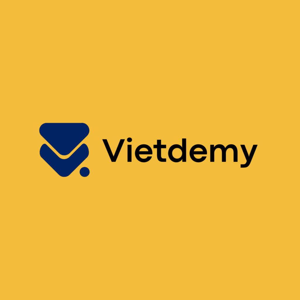
The Letter “V”: The “V” in the logo represents “Viet” in Vietdemy, an abbreviation for “Vietnamese.” This symbolizes the brand’s spirit and commitment to delivering high-quality online education, with a strong focus on learning and development for the global Vietnamese community.
Stylized Play Button: The Play button is a universal symbol in online learning videos, representing beginning and growth. Its stylized design in the Vietdemy logo reflects creativity and innovation in the way the brand delivers educational content. It also signifies the interactive and engaging nature of online learning.
The Dot: The dot in the logo represents focus, determination, and commitment to Vietdemy’s growth and mission. It symbolizes the stability and reliability of the brand in supporting learners throughout their educational journey. Additionally, it reflects Vietdemy’s dedication to delivering high-quality learning content and precise guidance, helping learners achieve their goals.
Application on Background Colors